# Interacting with Reddit API:
library("httr")
library("jsonlite")

# Manipulating data:
library("tidyverse")
library("tidytext")
library("glue")

# Plotting:
library("ggwordcloud")
library("showtext")Sentiment towards The Rings of Power
Comparing the responses of book readers and non-book readers
The Rings of Power is a controversial show that fills in the time before the events in J. R. R. Tolkien’s The Lord of the Rings with what some say is creative reimagining and others decry as glorified fan fiction. The root cause of this debate is that the show’s creators do not have the rights to all of the relevant source material. As a result they have had to go against what is technically canon, playing loose with timelines and at times making up major plot points.
Its main subreddit, /r/RingsofPower, has two weekly discussion threads per episode—one for book readers and one for non-book readers. Now that the first season has wrapped up, these threads represent a cool statistical opportunity: we can try to compare the feelings and reactions of these two groups across each episode!
Now, a warning: this post analyzes and visualizes text data from reddit.com. This includes text with coarse language that some may find offensive—if that is you, maybe skip this post.
Now, with that out of the way, let’s load all of the packages we’ll be needing:
A brief introduction to the Reddit API
Using tools from httr and jsonlite we can easily query the Reddit API (documented here) . Here, we get the 50 highest voted top-level comments from this thread on Episode 7.
res <-
  GET(
    "https://www.reddit.com/r/RingsofPower/comments/xxoyqz.json?sort=top&depth=1&limit=50",
    add_headers("user-agent" = "Rings-of-Power-Scraping")
  )

data <- fromJSON(rawToChar(res$content))
data <- data$data$children[[2]]$data
After some manipulation, data is now a data.frame with one row per comment and lots of columns, most of which are irrelevant to this analysis. The columns we care about are data$score (each comment’s votes) and data$body (the textual content of each comment):
data$score [1] 165 142 93 91 87 84 81 70 64 66 60 55 54 52 52 42 49 44 41
[20] 39 40 36 38 37 36 42 32 39 35 32 30 31 32 32 29 28 30 29
[39] 28 26 27 30 28 25 27 24 23 21 23 19 NAdata$body[1:3][1] "That speech about Harfoots staying true to each other was hilarious after they left him and his family for dead over a sprained ankle."
[2] "What is with the PowerPoint Mordor text?!\nYOU HAVE A GOOD ACTOR RIGHT THERE TO SAY MORDOR?\nThen all the orc boys and gals coulda been like MORDOR MORDOR MORDOR"
[3] "I was holding out hope that the “mithril will save the elves” plot line was a misdirect and the result of Annatar trying to deceive Gil-Galad. \n\nNope. Mithril is magical. \n\nK"This looks promising, the scores are decreasing and the text looks like reddit comments! Cross-referencing with the previously linked thread we can see that everything is working as intended, now it’s time to scale this example up.
All the data
This step is considerably more complicated, we need to get the 50 highest voted top-level comments for each discussion thread and then use tools from tidytext to “tokenize” each comment and identify words with “positive” and “negative” sentiments.
For now on, I’m going to collapse the code for manipulating data and generating graphics. If you are interested I encourage you to look through how I’ve done everything, but know that this post is not a guide on how to perform sentiment analysis. I highly recommend Text Mining with R: A Tidy Approach by Julia Silge and David Robinson if you would like to learn about how to use these tools.
The plot below shows the 20 most frequently occurring positive and negative words from the combined threads, according to the Bing lexicon:
Code
df_urls <-
  tibble(
    episode = rep(2:8, times = 2),
    book = rep(c(TRUE, FALSE), each = 7),
    url = c(

      # Book Spoiler threads:
      "x3qfr2", # Ep 1, 2
      "x9ngql", # Ep 3
      "xfgxa1", # Ep 4
      "xlmuu5", # Ep 5
      "xrrbrm", # Ep 6
      "xxoyqz", # Ep 7
      "y3j1zg", # Ep 8

      # Non-Spoiler threads:
      "x3qfqz", # Ep 1, 2
      "x9ngqa", # Ep 3
      "xfgx9y", # Ep 4
      "xlmurh", # Ep 5
      "xrrbtm", # Ep 6
      "xxoyvo", # Ep 7
      "y3j23u"  # Ep 8

    )
  ) |>
  mutate(
    url = glue("https://www.reddit.com/r/RingsofPower/comments/{url}.json?sort=top&depth=1&limit=50")
  )

comments_as_df <- function(url) {

  # Need to set user-agent header to avoid 429 error
  res <- GET(url, add_headers("user-agent" = "Rings-of-Power-Scraping"))
  data <- fromJSON(rawToChar(res$content))
  data <- data$data$children[[2]]$data

  data |>
    select(body, score) |>
    mutate(comment_id = 1:n())

}

df_urls <- df_urls |>
  rowwise() |>
  mutate(
    comments = list(comments_as_df(url)),
  )

# For each element (data.frame) in df_urls$comments,
# we're tokenizing with unnest_tokens() and removing stop words:
# df_urls$comments[[1]] |>
#   unnest_tokens(word, body) |>
#   anti_join(stop_words)

df_urls <- df_urls |>
  mutate(
    tidy_body = list(unnest_tokens(comments, word, body)),
    tidy_body = list(anti_join(tidy_body, stop_words))
  )

df_words <- df_urls |>
  unnest(tidy_body) |>
  select(episode, book, comment_id, word) |>
  inner_join(get_sentiments("bing"))

df_words |>
  count(word, sentiment, sort = TRUE) |>
  group_by(sentiment) |>
  slice_max(n, n = 20) |>
  mutate(word = reorder(word, n)) |>
  ggplot(aes(n, word, fill = sentiment)) +
  geom_col(show.legend = FALSE) +
  facet_wrap(vars(sentiment), ncol = 1, scales = "free_y") +
  labs(
    y = NULL,
    x = "Instances"
  )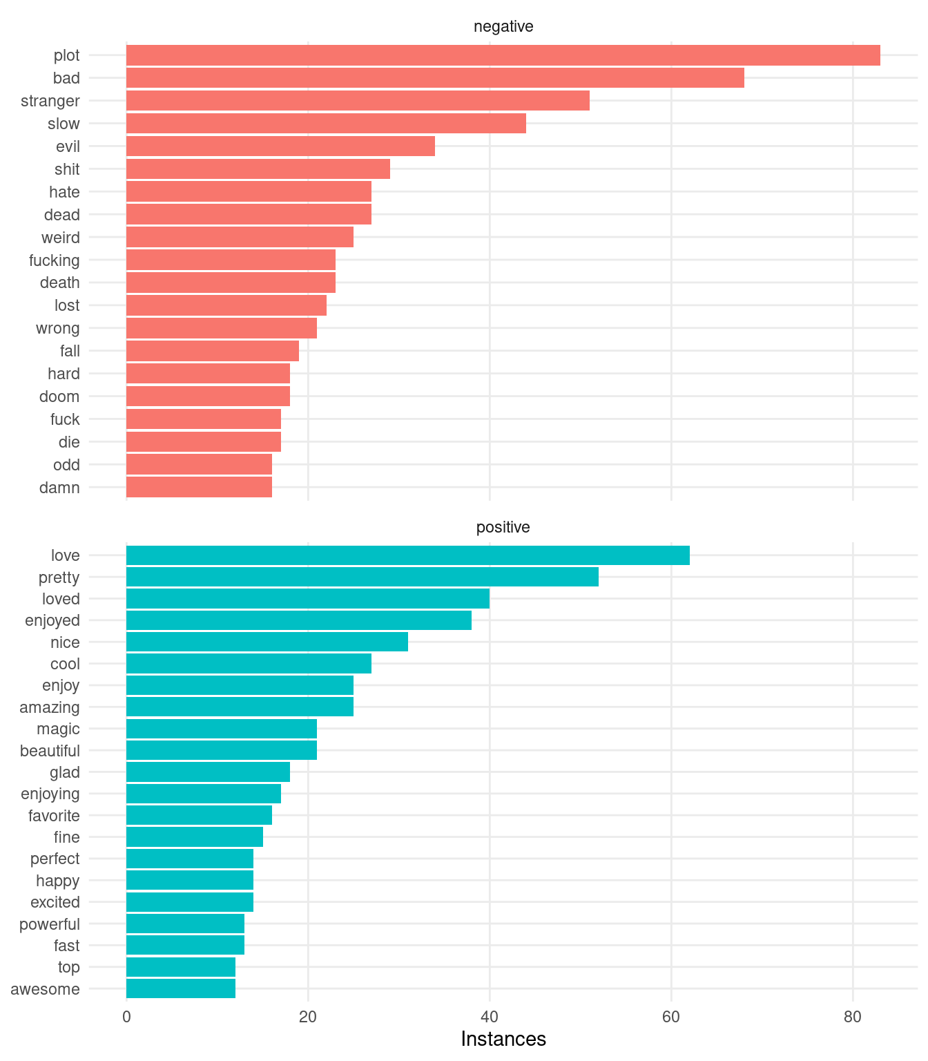
A few thoughts on the above plot. First, we see that Redditors do indeed love their four letter words—this is no surprise. Second (and more important), it looks like this naive attempt at sentiment analysis is getting hung up on words with particular meanings in the context of The Rings of Power. For example, 3 out of 5 of the most common “negative” words ("plot", "stranger", "evil") are obviously not conveying a negative sentiment, each with a specific neutral meaning in fantasy in general or in relation to the happenings in the show. Let’s remove a few of the obvious false negatives/positives and see how the resulting plot looks:
Code
df_words <- df_words |>
  filter(
    ! word %in% c(
      # False-Negatives:
      "plot", "stranger", "evil", "dead", "death", "doom", "die",
      "kill", "died", "conflict", "tension", "corrupted", "forged",
      # False-Positives:
      "magic", "powerful"
    )
  )

df_words |>
  count(word, sentiment, sort = TRUE) |>
  group_by(sentiment) |>
  slice_max(n, n = 20) |>
  mutate(word = reorder(word, n)) |>
  ggplot(aes(n, word, fill = sentiment)) +
  geom_col(show.legend = FALSE) +
  facet_wrap(vars(sentiment), ncol = 1, scales = "free_y") +
  labs(
    y = NULL,
    x = "Instances"
  )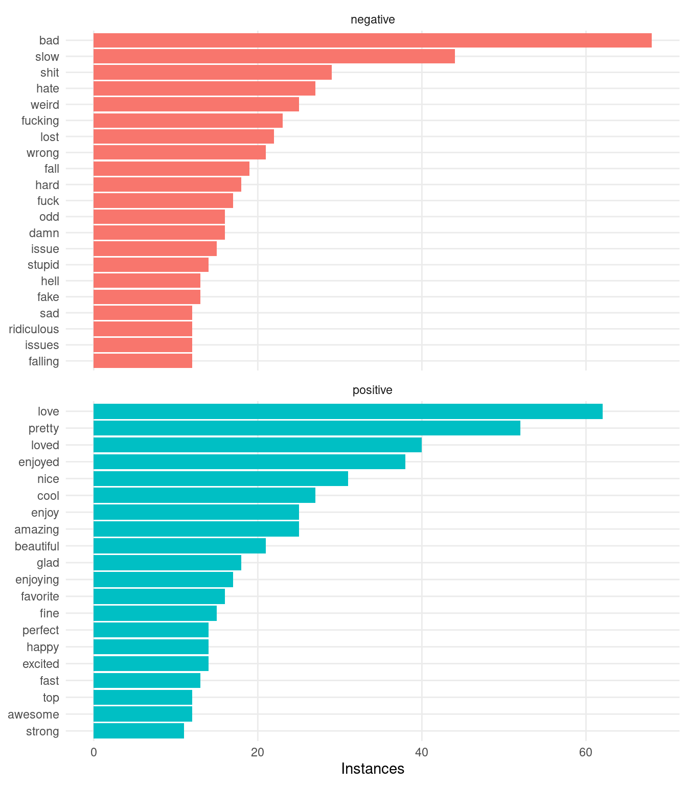
Much better! Now that we feel more confident about the words that we’ve identified as positive and negative, let’s proceed with a more in-depth analysis.
Analyzing trends
All that’s left for us to do is to compare the average sentiment between the book and non-book discussions. To do that, we’ll assign a score of +1 to positive words and -1 to negative words and compute the “average sentiment” for comments in each thread:
Code
df_sentiments <- df_words |>
  count(episode, book, comment_id, sentiment) |>
  group_by(episode, book) |>
  pivot_wider(names_from = sentiment, values_from = n, values_fill = 0) |>
  mutate(sentiment = positive - negative) |>
  summarize(avg_sentiment = mean(sentiment))

ggplot(df_sentiments, aes(episode, avg_sentiment, color = book, group = book)) +
  geom_abline(slope = 0, intercept = 0, linetype = "dashed") +
  geom_point() +
  geom_path() +
  scale_color_manual(NULL, values = c("slateblue", "firebrick"), labels = c("Non-Book Readers       ", "Book Readers")) +
  scale_x_continuous(breaks = 2:8, labels = c("1 + 2", 3:8)) +
  theme(legend.position = "top")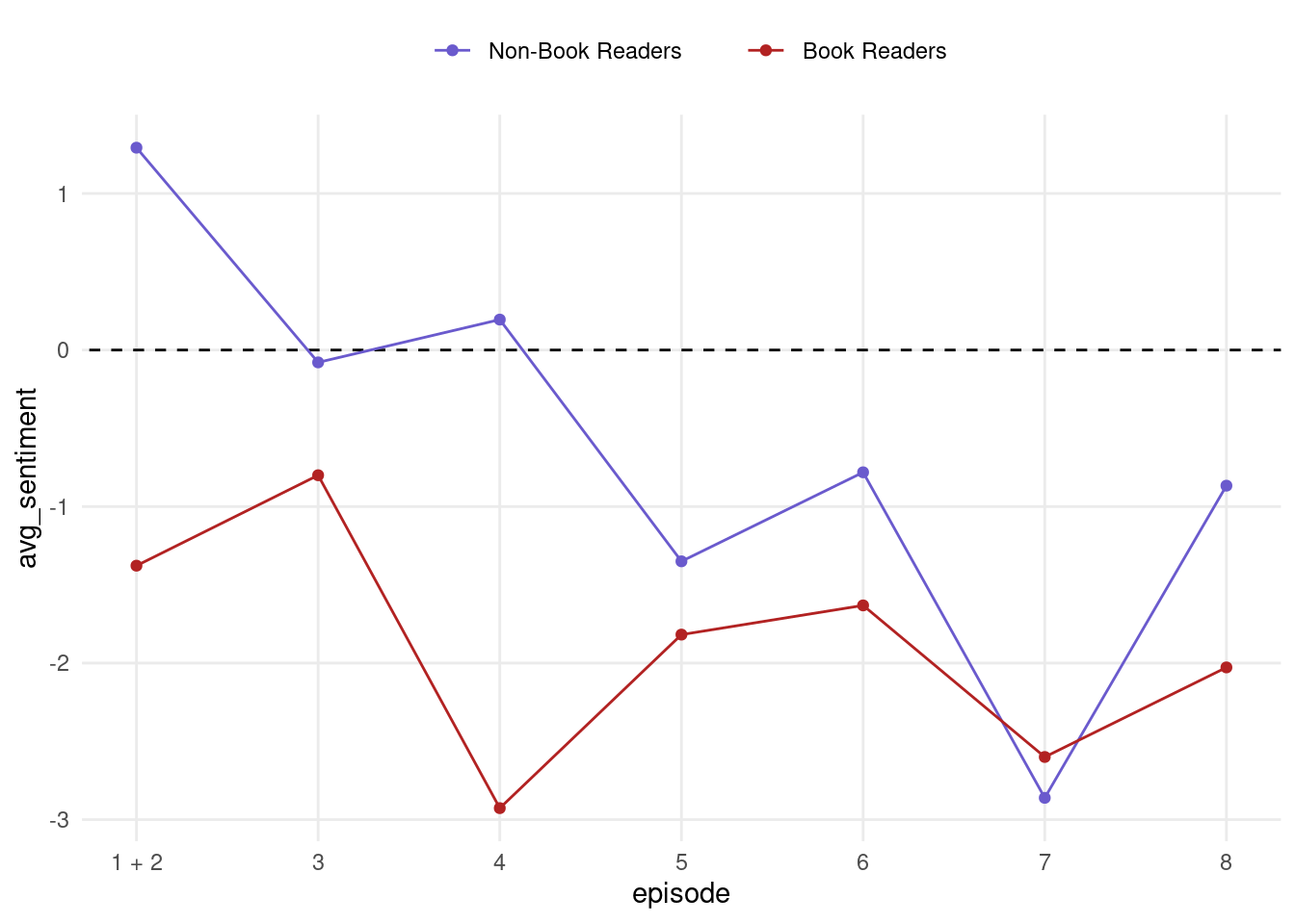
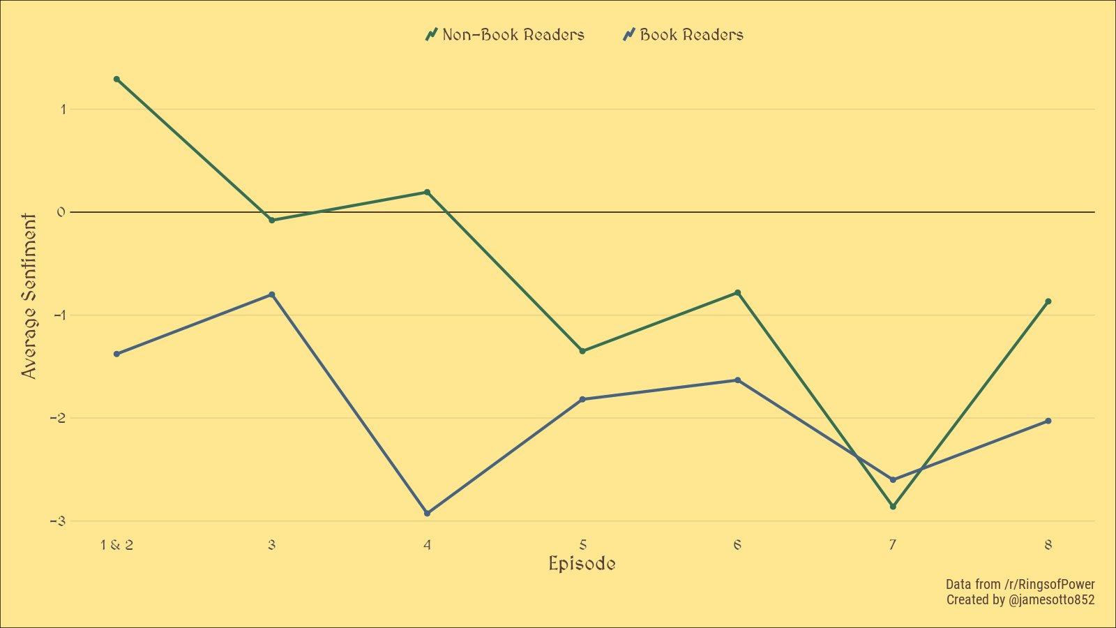
Interesting! It looks like non-book readers were initially positive about the show but slowly and consistently trended to be more negative over time, whereas book readers have been consistently negative. Both groups seem to have experienced an increase in average sentiment with the finale, an effect that is more pronounced in the case of the non-book readers. This generally agrees with my anecdotal experiences from talking with fellow Tolkien fans, however I expected the sentiment around the finale to be significantly more negative.
Adding some formatting, we can get a more visually interesting graphic:
Code
font_add_google("MedievalSharp")
font_add_google("Roboto Condensed")

showtext_auto()

# Save w/ width = 1600px and height = 900px
ggplot(df_sentiments, aes(episode, avg_sentiment, color = book, group = book)) +
  geom_abline(slope = 0, intercept = 0) +
  geom_point(size = 2.5, show.legend = FALSE) +
  geom_path(size = 1.5, key_glyph = draw_key_timeseries) +
  scale_color_manual(NULL, values = c("#376f52", "#47637e"), labels = c("Non-Book Readers       ", "Book Readers")) +
  scale_x_continuous(breaks = 2:8, labels = c("1 & 2", 3:8)) +
  labs(
    x = "Episode",
    y = "Average Sentiment",
    caption = "Data from /r/RingsofPower \n Created by @jamesotto852"
  ) +
  theme(
    text = element_text("MedievalSharp", colour = "#534137"),
    plot.caption = element_text("Roboto Condensed", size = 15),
    axis.title = element_text(size = 21),
    axis.text = element_text(size = 15),
    axis.title.y = element_text(margin = margin(r = 10)),
    legend.text = element_text(size = 18),
    legend.position = "top",
    legend.key.size = unit(.4, "cm"),
    panel.grid.major.y = element_line(colour = alpha("black", .1)),
    panel.grid.major.x = element_blank(),
    plot.background = element_rect(fill = "#ffe791"),
    plot.margin = unit(rep(.8, 4), "cm")
  )
Final thoughts
While the results we found are interesting it’s important to remember that this is a very simple analysis based on positive and negative associations of individual words. While we did our best to remove words that were obviously being misclassified, I am sure that that there are still words that are being incorrectly identified as positive or negative that are biasing our results.
A more involved analysis is certainly called for; for example it would be good to consider larger “n-grams”, allowing our tokens to consist of sequences of words. This approach would be more robust and would likely result in more interesting and nuanced conclusions.
If you are interested in analyzing this data on your own, I have made the data used in this analysis available for download. If you find anything please let me know!
Bonus: some word clouds!
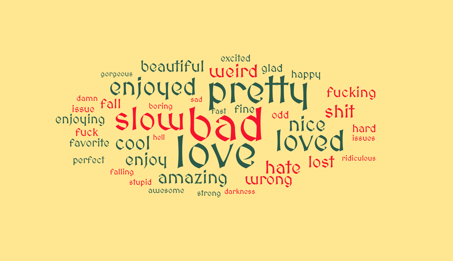
ggwordcloud is a really powerful package which provides robust tools for making word clouds within the ggplot2 framework. Below, we include a word cloud with the 20 most popular positive and negative words, sized according to their relative frequency:
Code
df_words |>
  count(word, sentiment, sort = TRUE) |>
  group_by(sentiment) |>
  slice_max(n, n = 20) |>
  ungroup() |>
  arrange(desc(n)) |>
  ggplot(aes(label = word, size = n, color = sentiment)) +
  geom_text_wordcloud(family = "MedievalSharp") +
  geom_text_wordcloud() +
  scale_radius(range = c(0, 40), limits = c(0, NA)) +
  scale_color_manual(values = c("#f4142e", "#2b5a4a")) +
  theme_void() +
  theme(
    panel.background = element_rect(fill = "#ffe791")
  )
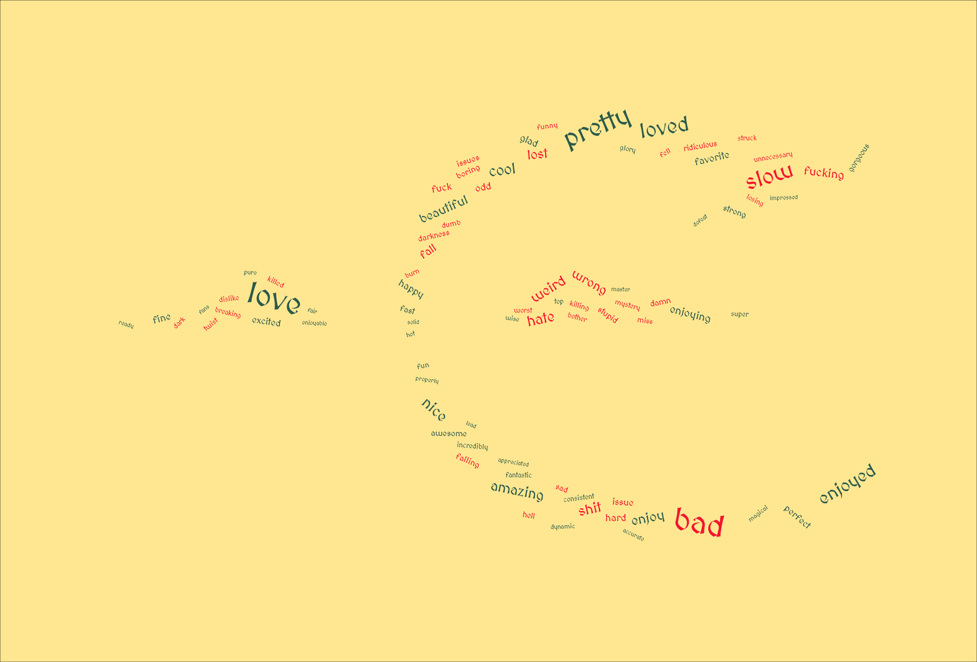
And now, in everyone’s favorite secret shape:
Code
mask <- png::readPNG(here::here("posts/2022-10-15-Rings-of-Power/Sauron Symbol.png"))

# Save with width = 2000px, height = 1355px
df_words |>
  count(word, sentiment, sort = TRUE) |>
  group_by(sentiment) |>
  slice_max(n, n = 35) |>
  ungroup() |>
  slice_sample(prop = 1) |>
  mutate(angle = 45 * rnorm(n(), sd = .5)) |>
  ggplot(aes(label = word, size = n, color = sentiment, angle = angle)) +
  geom_text_wordcloud(family = "MedievalSharp", mask = mask, eccentricity = .35) +
  scale_radius(range = c(2, 17), limits = c(1, NA)) +
  scale_color_manual(values = c("#f4142e", "#2b5a4a")) +
  theme_void() +
  theme(
    panel.background = element_rect(fill = "#ffe791")
  )